Cactus UI — Accessibility focused react component library
Türkçe version için: tıklayın
Hi there! In this article, I will try to introduce Cactus UI that accessibility focused react component library developed by us as CsTech.
Before I start explaining the library, the flow of the article will be as follows, along with a few issues that I would like to go over:
- What’s web accessibility?
- Why did we develop an accessibility focused component library?
- Cactus UI Introduction
Let’s go…
What’s web accessibility?

Accessibility means that any product or service is accessible and usable by everyone, including the disabled and the elderly.
According to the report of the World Health Organization, approximately %15 of the world’s population (almost 1.2 billion people) continues to live with some kind of disability.
For this reason, as developers, we should take care to create products that everyone can easily access and use while developing a website.
In our scope, accessibility represents that all people can easily use the product we have developed and that any obstacle does not prevent the use of the product we have developed.
To achieve this, the World Wide Consortium’s (W3C) Web Accessibility Initiative (WAI) created the Web Content Accessibility Guidelines (WCAG). We, the developers, can ensure that people with disabilities can easily experience/use the product we have created by following these guidelines for web accessibility without any obstacles, with the help of the accessibility tools on their devices.
To reach more detail and different kind of perspectives, I recommend to you take a look at Huge Missing Part: Web Accessibility article written by Osman Akar from CsTech.
Why did we develop an accessibility-oriented component library?
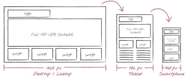
In fact, as developers, we style and combine various HTML elements suitable for our purpose when creating a website. This is the main way of creating the websites we see/use.
That’s why when we develop, we use or create component libraries that collect these elements that are customized for certain purposes. While many of these libraries are developed/used for easy access to a consistent design guide and also rapid development, some libraries can be created for different purposes without any styling thought.
Our main aim and motivation when developing Cactus UI were to have a component library that we could use on all websites we developed as CsTech, which would allow us to create websites that comply with the necessary regulations regarding accessibility.
While developing the library that will meet our requirements, we made it open source because we want to contribute to the developer community. 🥳

Now let’s get to know Cactus UI more closely.
Cactus UI
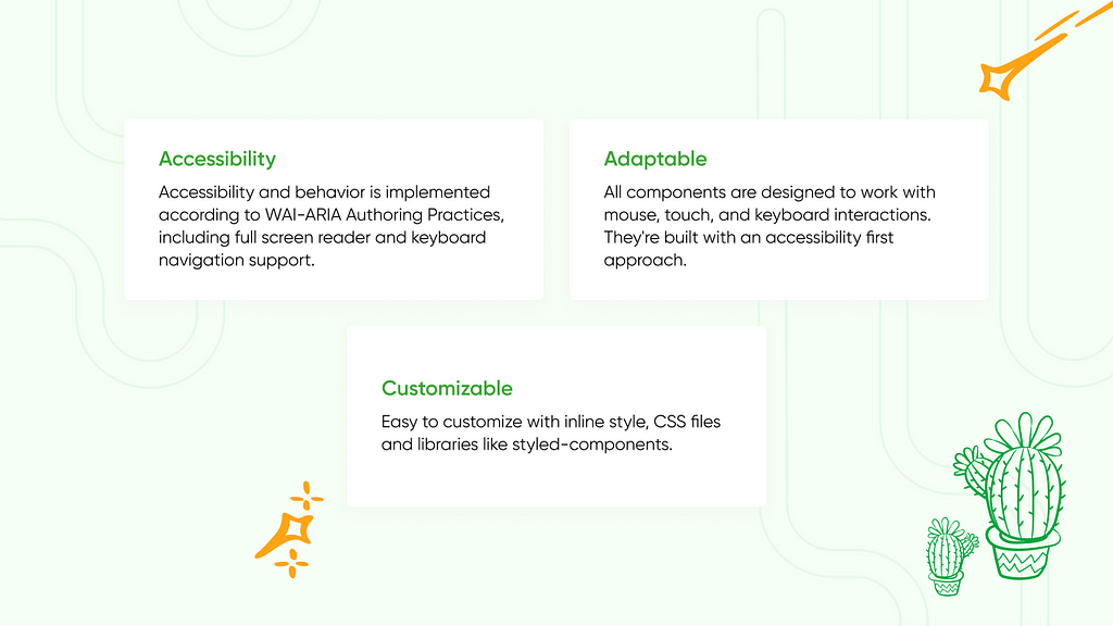
Cactus UI, is an accessibility focused, minimal styling React components library containing 13 components and various custom hooks developed in accordance with the Web Content Accessibility Guidelines (WCAG).
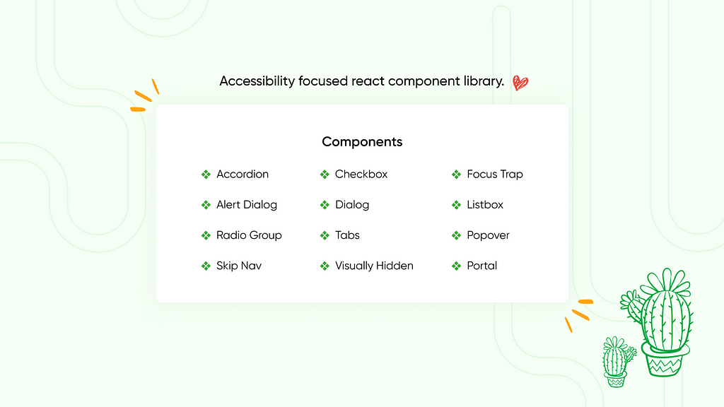
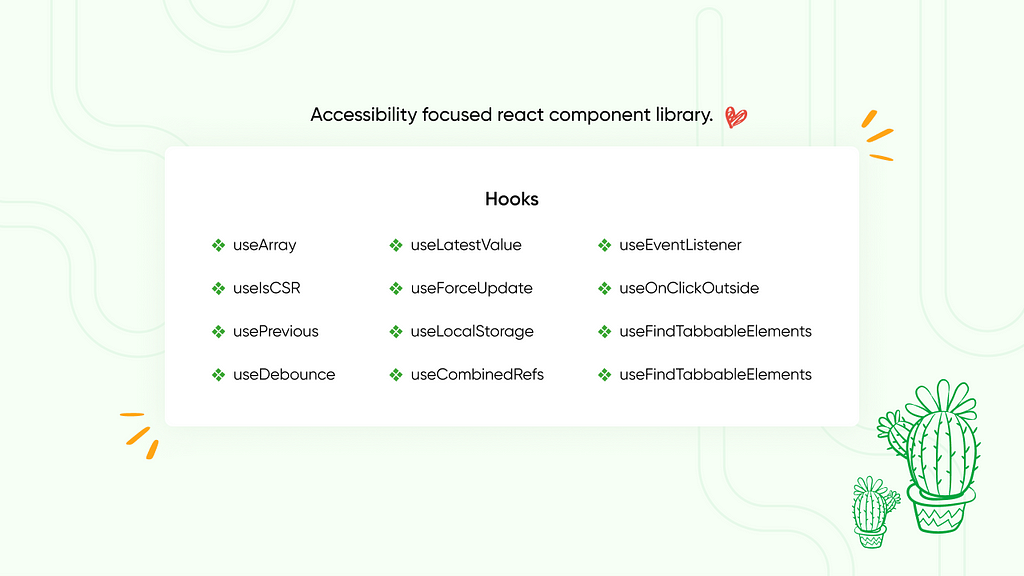
Since the main focus is to develop a library in accordance with the principles of accessibility, Cactus UI was developed in a way that without adopting a special design language only includes the necessary styling of components for proper work. However, the developer can easily style it according to the design she/he needs. Also, the developer can use it with different libraries (styled-components etc.) or can style all components according to she/he design with the help of css.
You can review the Cactus UI documentation to learn how could you use all components and hooks. If you need any further information, do not hesitate to send your question to us on Github.
While we developing Cactus UI, we took care to ensure that it has a high DX, is easy to implement and is keep it as flexible as possible. Let’s see how easy it is to use a component from Cactus UI with an example.
Let’s implement the Cactus UI — Listbox component in our project together.
- Install the Cactus UI to your project:
- Import the whole library

// For Npm users:
npm install @ciceksepeti/cui

// For Yarn users:
yarn add @ciceksepeti/cui

- or import only the component you need

// For Npm users:
npm install @ciceksepeti/cui-listbox

// For Yarn users:
yarn add @ciceksepeti/cui-listbox
2. Import Listbox and ListboxItem in the relevant file:
import React from "react";
import { Listbox, ListboxItem } from "@ciceksepeti/cui-listbox";

// Base styles comes from Cactus UI
import "@ciceksepeti/cui-listbox/styles.css";
// Custom css that will include our styles
import "./listbox.css";

export function OurListbox() {
  return (
    <div
      style={{
        height: "150px",
        padding: "30px"
      }}
    >
      <p className="title">CSTech Listbox</p>
      <Listbox aria-labelledby="example-listbox">
        <ListboxItem value="listbox Item 1">Listbox Item 1</ListboxItem>
        <ListboxItem value="listbox Item 2">Listbox Item 2</ListboxItem>
        <ListboxItem value="listbox Item 3">Listbox Item 3</ListboxItem>
        <ListboxItem value="Listbox Item 4">Listbox Item 4</ListboxItem>
      </Listbox>
    </div>
  );
}
export default OurListbox;
Congratulations! Your Listbox component is ready to use and it looks like as below:
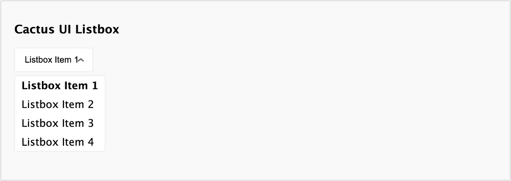
As I mentioned earlier, Cactus UI only includes the minimum styles needed for the component to work properly, so it does not look very delicious, but it has all the necessary features for accessibility. For example; you can navigate and select in the Listbox with the keyboard. These movements are detected by the screen reader, and the value of the focused element can be read aloud by the screen reader!
So how can we style this component according to the design we need? The answer to this is in the styling section on our documentation site. We provide you with many css-selectors for you to style all components easily, you can see selectors of the Listbox component below:
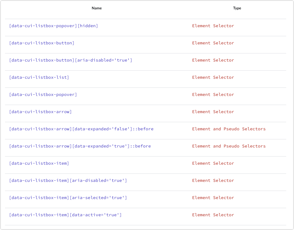
With these selectors you can style your Listbox component as you wish through your .css fıle:
[data-cui-listbox-button] {
  width: 350px;
  height: 48px;
  font-size: 16px;
  font-weight: 600;
  color: #93b74d;
  background-color: #48625b;
}

[data-cui-listbox-arrow] {
  color: white;
  font-size: 16px;
  margin-right: 4px;
}

[data-cui-listbox-popover] {
  overflow: hidden;
  border-radius: 4px;
  background-color: #48625b;
  border: 1px solid rgb(171, 202, 171);
}

[data-cui-listbox-item] {
  color: #9bc14f;
  font-weight: 600;
  padding: 12px 10px;
}

[data-cui-listbox-item][data-active="true"] {
  color: #1c7450;
  background-color: #d6dfc3;
}
After styling, the Listbox component looks like this:
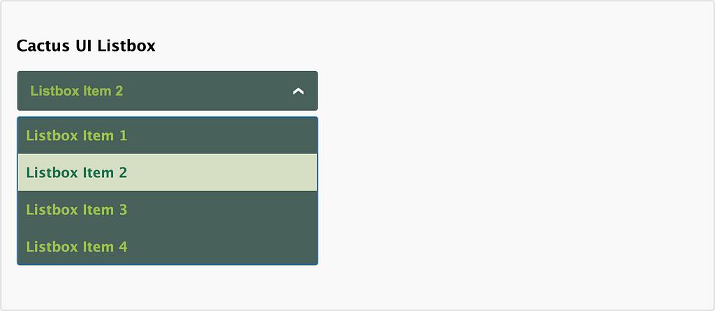
It’s that easy! You can find how to use a component in Cactus UI, styling details and examples on the relevant component’s documentation page.
Also, there is also a playground for each component page so you can play and test components easily.
Open Source — Contribution
Developed with an accessibility focus to create websites where everyone can benefit equally, Cactus UI aims to add value to the developer’s community and to grow its own value with your contributions.
In addition to questions about the issues you are experiencing, we also welcome your ideas and contributions about the areas you see lacking or want to improve.
Cactus UI — Github: https://github.com/ciceksepetitech/cactus-ui
Until we meet again, stay in tech.
Oğuzhan Sofuoğlu
Frontend Developer
References:
- https://www.w3.org/TR/WCAG21/
- https://www.freecodecamp.org/news/web-accessibility-best-practices-and-checklist/
- https://medium.com/cstech/huge-missing-part-web-accessibility-7951724158da
- https://cactus-ui.ciceksepeti.dev/
Cactus UI — Accessibility focused react component library was originally published in ÇSTech on Medium, where people are continuing the conversation by highlighting and responding to this story.